Factors Affecting Individual Medical Expenditure: Multiple Linear Regression and Machine Learning Prediction(R language)
I established mutiple regression models using data from 1338 US nationals. Robust standard errors were utilized to address heteroscedasticity issues. The results indicated that smokers had an average medical expenditure $23848 higher than non-smokers. Lastly, I compared predictive capabilities: XGBoost (RMSE: 4941) demonstrated greater precision compared to linear regression (RMSE: 6568).
The data

The dataset Medical Cost Personal Datasets is available on Kaggle, which consists of cross-sectional data from 1,338 U.S. nationals. Features include basic information such as age, gender, and region of residence, as well as each person’s BMI and smoking habits.
The target variable is each person’s medical expenses (paid by insurance), which is a continuous variable. With this dataset, we can explore which demographics incur higher medical expenses.
Univariate Analysis
Since gender, region of residence, and smoking habits are categorical variables, they must first be converted using one-hot encoding before analysis; otherwise, errors will occur. The R code is as follows:
data$sex <- ifelse(data$sex=='male',1,0)
data$smoker <- ifelse(data$smoker=='yes',1,0)
data <- data %>%
  mutate(southwest=ifelse(region=='southwest',1,0),
         southeast=ifelse(region=='southeast',1,0),
         northwest=ifelse(region=='northwest',1,0),
         northeast=ifelse(region=='northeast',1,0))
data <- data %>% select(-region)
summary(data)
In the continuous variables, the average age is 39 years, with a minimum of 18 and a maximum of 64 years. The average BMI is 30, but surprisingly, the median is also 30, indicating that more than half of the individuals are classified as obese (BMI 30+).
I looked up some data and found that according to the CDC in 2022, the obesity rate in the USA is as high as 42%! This is truly astonishing.
Target Variable
The average medical expense (Charge) is US$13,270, with a median of $9,382. These figures are not exaggerated; medical expenses in the United States are indeed that high, especially considering this might represent an individual’s cumulative medical costs to date (the original dataset does not specify whether these are current or cumulative expenses).
Additionally, the fact that the average is higher than the median indicates that the data is mostly concentrated on the left side and has sparse extreme values, resulting in a right-skewed distribution, as illustrated in the following graph.
hist_plot <- ggplot(data, aes(x = charges)) +
  geom_histogram(fill = "#036564", color = "#033649", binwidth = diff(range(data$charges))/30) +
  labs(title = "Distribution of charges", x = "x", y = "Pr(x)") +
  theme_minimal()
print(hist_plot)
I wanted to see if medical expenses also follow the 80/20 rule, meaning that a minority of people account for the majority of medical costs. It turns out that the top 20% account for about 51.68% of the expenses.
# Calculate the number of observations that constitute the top 20%
top_20_percent_count <- ceiling(length(data$charges) * 0.20)

# Sort the data frame by 'charges' in descending order to get the top charges
data_sorted <- data[order(-data$charges), ]

# Calculate the sum of the top 20% charges using the dynamically calculated count
top_20_percent_charges <- sum(data_sorted$charges[1:top_20_percent_count])

# Calculate the total sum of charges
total_charges <- sum(data$charges)

# Calculate the proportion of the top 20% charges relative to the total charges
proportion_top_20 <- top_20_percent_charges / total_charges

# Print the proportion
print(proportion_top_20)
[1] 0.5168555
But what about the top 30% of individuals? They account for 64.27% of the total medical expenses.
top_30_percent_count <- ceiling(length(data$charges) * 0.30)

# Sort the data frame by 'charges' in descending order to get the top charges
data_sorted <- data[order(-data$charges), ]

# Calculate the sum of the top 20% charges using the dynamically calculated count
top_30_percent_charges <- sum(data_sorted$charges[1:top_30_percent_count])

# Calculate the total sum of charges
total_charges <- sum(data$charges)

# Calculate the proportion of the top 20% charges relative to the total charges
proportion_top_30 <- top_30_percent_charges / total_charges

# Print the proportion
print(proportion_top_30)
[1] 0.6427482
This result surprises me because it is very similar to the outcome of my analysis of 530,000 Black Friday shopping transactions.
In the Black Friday data, the top 20% of shoppers accounted for 55% of total spending; in the medical expense data, the top 20% accounted for 51% of total medical expenses.
In the Black Friday data, the top 30% of shoppers accounted for 68% of total spending; in the medical expense data, the top 30% accounted for approximately 64% of total medical expenses.
This suggests that in the real world, a minority of people account for a majority of expenses/consumption. However, in practice, the distribution isn’t as close to an 80/20 split. In my professional experience and data project analyses, it tends to follow more of a 70/30 rule.
Bivariate Analysis
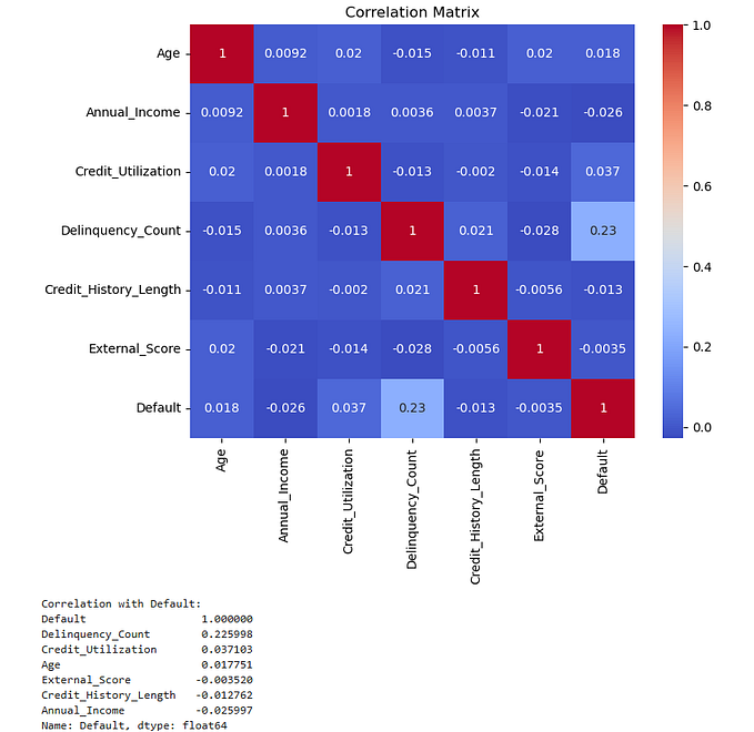
Correlation Heatmap
corrplot(cor_matrix, method = "square", type = "upper", tl.col = "black", tl.srt = 45,tl.cex = 0.7)
In the correlation heatmap, the correlation coefficient between smoking habit (smoker) and medical charges is 0.7872, indicating a high positive correlation. The correlation coefficient between BMI and medical charges is 0.1983, indicating a low positive correlation.
The Relationship between Smoking Habit, Gender, and Medical Charges
We divided the population into four subgroups based on gender and smoking status and observed whether there are differences in medical charges among these four subgroups. The R code is as follows:
ggplot(data1, aes(x = sex, y = charges, fill = smoker)) +
  geom_boxplot() +
  scale_fill_manual(values = c("#9ACD32", "#FF7F50")) +
  theme_minimal()
It can be observed that smokers have higher medical expenses compared to non-smokers, and this difference is consistent across different genders.
The Relationship between Smoking Habit and Age, and Medical Charges
ggplot(data, aes(x = age, y = charges, color = as.factor(smoker))) +
  geom_point() +
  geom_smooth(method = "lm", se = FALSE) +
  labs(title = "Smokers and non-smokers") +
  scale_color_manual(values = c("#FC642D", "#B13E53"),
                     labels = c("Non-smoker", "Smoker"))+
  theme_minimal()
Let’s take a look at the relationship between age and medical expenses. It can be observed that as age increases, medical expenses also tend to increase. This is not surprising as older individuals typically have more health issues, leading to higher medical expenses. Additionally, regardless of age, smokers generally have higher medical expenses compared to non-smokers.
The Relationship between Smoking Habit and BMI, and Medical Charges
ggplot(data, aes(x = bmi, y = charges, color = as.factor(smoker))) +
  geom_point() +
  geom_smooth(method = "lm", se = FALSE) +
  labs(title = "Smokers and non-smokers") +
  scale_color_manual(values = c("#FC642D", "#B13E53"),
                     labels = c("Non-smoker", "Smoker"))+
  theme_minimal()
It can be observed that BMI does not show a significant relationship among non-smokers (orange line), but there is a highly significant positive relationship between BMI and medical expenses among smokers (red line). This suggests that in the presence of both obesity and smoking habits, medical expenses for smokers increase with higher BMIs. This is an intriguing phenomenon.
Multiple Regression Analysis
The target variable is medical expenses, which is a continuous variable. Therefore, we can build a multiple regression model as follows:

How do we determine the best regression slope coefficient? The mainstream methods include OLS (Ordinary Least Squares), MLE (Maximum Likelihood Estimation), moment methods, and others. Here, we’ll introduce OLS.
SSE stands for the sum of squared errors, and we aim to minimize SSE to find the optimal regression line and coefficients.

There must be an optimal coefficient beta that minimizes SSE, so the first derivative must be equal to zero:

The optimal regression coefficients can be derived as follows:

The first derivative being zero is only a necessary condition for finding the local minimum(as the local maximum also has a first derivative of zero). It must satisfy the sufficient condition, namely, the second derivative being a positive-definite matrix:

Below, I’ll demonstrate OLS using R language.
Y = as.matrix(data %>% select(charges))
X = as.matrix(data %>% select(constant, age, sex, bmi, children,
                              smoker, southwest, southeast, northwest))

beta_hat = solve(t(X)%*%X) %*% t(X)%*%Y
print(beta_hat)
The optimal regression slope is derived as follows:

Of course, a more convenient method is to call the "lm" package in R.
model <- lm((charges)~age+sex+bmi+children+smoker+
southwest+southeast+northwest,data=data)
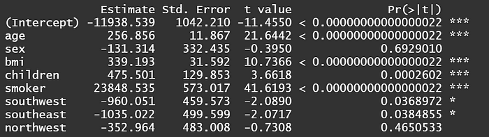
summary(model)
The results above show that the regression slope is the same. Among them, age, BMI, and smoking habits are all significant at the 1% level.
When interpreting coefficients, attention should be paid to categorical variables such as gender (sex), smoking habits (smoker), and region of residence. These categorical variables must undergo one-hot encoding before running the model. Taking gender as anexample, we assign males as 1 and females as 0. Mathematically, this represents the difference between them using the intercept term.
Taking gender as an example, the coefficient is -131.3. As the baseline is female = 0, the coefficient means that “males have an average medical expense $131.3 lower than females”.
For smoking habits (smoker), with a coefficient of 23838.5, since the baseline is non-smoker = 0, it means “smokers have an average medical expense $23838.5 higher than non-smokers”.
As for continuous variables like BMI and age, how should we interpret them? Taking the coefficient of BMI as 339.2 for example, it means “for every one unit increase in BMI, the average medical expense increases by $339.2”. Similarly, with the coefficient of age as 256.9, it means “for every one unit increase in age, the average medical expense increases by $256.9”.
It’s important to include the word ‘average’ in explanations to be precise because this represents the expected value E(X) under normal distribution. Each individual may be affected more or less due to interference factors, meaning they oscillate around E(X).
Method for checking multicollinearity: Variance Inflation Factor (VIF)
Before running regression, it’s necessary to check for multicollinearity, which refers to high overlap and similarity between variables. The principle of VIF is simple: each explanatory variable in the model is treated as the dependent variable in auxiliary regressions.
For example, if I have three explanatory variables X1, X2, and X3, I’ll run regressions of X2 and X3 on X1, X1 and X3 on X2, and X1 and X2 on X3, respectively. This way, I’ll obtain three coefficients of determination (R-squared), and the VIF formula is given by:

In general, VIF values less than 10 are considered to indicate no severe multicollinearity between variables. In other words, the coefficients of determination in auxiliary regressions should be below 0.9. A stricter criterion is VIF values less than 5, indicating no severe multicollinearity between variables, with coefficients of determination below 0.8.
vif_values <- vif(model)
print(vif_values)
The results show that all VIF values are less than 5, indicating that the coefficients of determination in auxiliary regressions are all below 0.8. From this, we can infer that there is no severe multicollinearity between variables.
In the presence of multicollinearity, although the coefficients remain unbiased, the standard errors tend to increase, resulting in very small t-values, making statistical significance less likely and the null hypothesis more easily accepted. Common solutions include removing variables, increasing sample size, or, if willing to sacrifice some unbiasedness while still maintaining effectiveness, using Ridge Regression.
Hypothesiss Testing
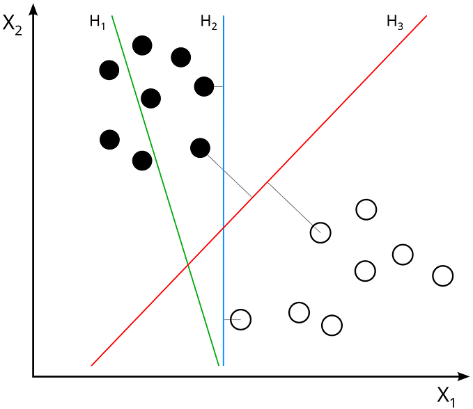
To answer the question of whether a variable has a significant effect on medical expenses from a statistical perspective, we must conduct a significance test on β1 (slope).
At a significance level of 5%, we set the null hypothesis: “β1 equals zero”; and the alternative hypothesis: “β1 does not equal zero.”
The significance of whether β1 is zero lies in testing whether the explanatory variable X can explain the response variable Y. If the coefficient is 0, the slope of the coefficient is a horizontal line, indicating that X cannot explain Y. As shown in the figure below:

We are most interested in the variables of smoking habit (smoker) and BMI.
Under the null hypothesis that the coefficient of smoker is 0, the t-statistic is 57.723, with 1329 degrees of freedom. The critical value for a 1% significance level t-distribution is 2.326. Therefore, we reject the null hypothesis that X and Y are unrelated, indicating that the smoker variable statistically significantly affects medical expenses.
Similarly, under the null hypothesis that the coefficient of BMI is 0, the t-statistic is 11.86, with 1329 degrees of freedom. The critical value for a 1% significance level t-distribution is 2.326. Hence, we reject the null hypothesis that X and Y are unrelated, indicating that the BMI variable statistically significantly affects medical expenses.
Heteroscedasticity

Heteroscedasticity refers to the situation where the variability of a random variable is not constant across its range. Using the example depicted in the graph, let’s assume x represents study time and y represents exam scores.
We can observe that for x1 (2 hours of study per week), exam scores do not vary much and are approximately between 20 and 30 points. However, for x3 (10 hours of study per week), the efficiency of study varies among individuals, resulting in exam scores ranging from as low as 20 points to as high as 80 points. Such data distribution is quite common in practice and requires careful handling.
Despite the presence of heteroscedasticity, OLS estimates remain unbiased and consistent. Therefore, the previously estimated coefficient for smoking, indicating an increase of $23848 in medical expenses for smokers, remains correct, but loses efficiency and is not the Best Linear Unbiased Estimator (BLUE).
In other words, because the estimated standard errors are biased, the t-test may become ineffective. This means that the t-value for the smoking coefficient may not be as high as the previously estimated 57.
To test for heteroscedasticity, this study conducts the Breusch-Pagan (BP) test. The bptest() results show BP = 105.52, Df = 8, p = < 2.22e-16, where the p-value approaches 0. Therefore, we reject the null hypothesis of homoscedasticity and conclude that heteroscedasticity exists.
How can we address this issue? I attempted two methods: 1. Taking the logarithm 2. Robust standard errors.
Taking the logarithm
After taking the logarithm of the target variable medical expenses, we observe a shift from a right-tailed distribution towards a normal distribution.


After taking the logarithm, the log-level model is as follows:

Perform the Breusch-Pagan (BP) test on this model. The bptest() result shows: BP = 48.866, df = 8, p-value = 6.745e-08. Although the situation has improved significantly, heteroscedasticity still exists.
Robust Standard Errors
“Robust standard errors, also known as Heteroskedasticity-consistent standard errors (HCEs), come in five versions: HC0 to HC4. Here, we adopt the original HC0 version proposed by White in 1980.

Where diag() represents the diagonal matrix obtained by squaring the residuals from the original regression and placing them on the diagonal, with all non-diagonal elements being zero. The R code is as follows:
OLS_Regression <- lm(charges~age+sex+bmi+children+smoker+
                        southwest+southeast+northwest, data=data)
robust_summary <- coeftest(OLS_Regression, vcov. = vcovHC(OLS_Regression5, type = "HC0"))
robust_summary
It’s important to note that robust standard errors do not affect the residuals of the model itself; they only adjust the calculation of standard errors for coefficients. This means that the residuals of the model still exhibit heteroscedasticity, so there’s no need for another BP test.
The next step should be to use these robust standard errors for hypothesis testing or confidence interval calculations. Therefore, I discard the original standard errors and proceed with hypothesis testing using the robust standard errors adjusted as above.
The results show that the coefficient for smoking remains unchanged at $23848, but the t-value decreases from the original 57 to 41. However, the p-value still remains extremely low, indicating that the smoking variable remains highly significant even after adjusting for standard errors. It can still be used to explain the variation in medical expenses.
Prediction: Machine Learning vs. Linear Regression
We compare the predictive abilities of machine learning models such as XGBoost, Random Forest, etc., with linear regression.
All three models use RMSE to compare accuracy. The formula for RMSE is as follows:

Where Yi hat represents the predicted values of the model, and Yi represents the actual values. Therefore, the smaller the difference between these two, the better. After squaring and taking the square root, the final RMSE should be as small as possible.

You can see that XGBoost performs the best with an RMSE of 4941, while linear regression performs the worst with an RMSE of 6568. In describing this performance, we use ‘ordinary’ instead of ‘poor’ because linear regression still performs significantly better than random guessing.
The reason for the relatively poor performance of linear regression is simply that the competition (i.e., machine learning) is too strong. In an era without machine learning, linear regression was still a viable option for prediction.
Comparing Predictive Ability: Sampling
Looking at just the RMSE might be a bit dull, so let’s take a sample: a 56-year-old male, let’s call him John! It’s evident that XGBoost predicts John’s medical expenses most accurately.

Let’s draw another sample: a 28-year-old female, let’s call her Mary!

It’s obvious that Linear Regression predicts Mary’s medical expenses most closely, which is interesting. So I drew some more samples from the ‘non-smoker’ group to take a look.

The closest predictions are marked in red, while the farthest predictions are in green. It can be observed that Linear Regression has the most green blocks, indicating its predictive ability is still inferior to machine learning. However, cases 8 and 10 exhibit the best predictive performance for Linear Regression. Why does Linear Regression sometimes outperform machine learning in predicting ‘non-smokers’? The explanation is as follows.

Since linear regression represents a plane in three-dimensional space, it implies that data points can be explained by the simplest linear relationship (see the figure above).
The accurate predictions of linear regression indicate that the actual values for these two cases are not far from this plane. Therefore, linear regression captures such linear relationships and outperforms machine learning. Machine learning, on the other hand, exhibits stronger predictive ability when the data follows a non-linear relationship.
Another advantage of linear regression is its ability to determine the marginal effect of a one-unit increase in X on Y, which machine learning cannot achieve.
However, considering the overall predictive performance, machine learning (RMSE: 4941) still outperforms linear regression (RMSE: 6568). Therefore, it is still recommended to use machine learning for predicting medical expenses.
Finally, I sampled some data from ‘smokers,’ and it can be observed that all the green blocks represent linear regression, indicating its predictive ability is far inferior to machine learning.

Why does linear regression perform so poorly in predicting ‘smokers’? Is it because the competition (machine learning) is too strong, or is it because linear regression itself is too weak? We offer an explanation: ‘Perhaps both!’

The data studied in this article pertains to the level of medical expenses, with the variable ‘smoking’ being a dummy variable (1=smoker). Unfortunately, as seen in the boxplot above, there is already a significant difference in medical expenses between smokers and non-smokers, leading to a highly significant variable (p-value approaching 0) and a regression coefficient as high as 23848.
As a result, simply categorizing individuals into smokers and non-smokers can lead to a direct increase of $23848 in medical expenses, regardless of gender or age. This simplistic categorization poses challenges for linear regression to make nuanced predictions.
However, smoking behavior itself can be quantified into numerical values, such as the number of cigarettes smoked per week, monthly expenditure on cigarettes, or a smoking index (ranging from 1 to 10), among others. With such data, I believe the predictive performance of linear regression would not be too poor.
Conclusion
This article employs R language to construct a multiple regression model using data from 1,338 American nationals. The empirical results reveal:
- The top 30% of individuals account for 64.27% of total medical expenses, demonstrating a 70/30 rule.
- In the correlation coefficient heatmap, the habit of smoking shows a high positive correlation with medical expenses, with a coefficient of 0.7872.
- Smokers incur an average of US$23,848 more in medical expenses than non-smokers.
- The Breusch-Pagan (BP) test identified the presence of heteroscedasticity. After correcting for robust standard errors, the coefficient for smoking remained unchanged at $23,848, but the t-value decreased from 57 to 41. However, with the p-value still at an extremely small fraction of one percent, the coefficient remains highly significant and can be used to explain variations in medical costs.
- Finally, comparing overall predictive power, XGboost (RMSE: 4941) proved more accurate than linear regression (RMSE: 6568). However, linear regression performed better for certain samples. We explain this by noting that the accurate predictions of linear regression indicate that the actual values of these cases are not far from the plane, thus capturing such linear relationships better than machine learning.